How it works
Your file only needs the variables you’re overriding — everything you leave out keeps its default. A minimal theme is genuinely small:Theming is an account-level setting. There’s no query parameter or runtime API for it — send the file to your Ripio contact. You can also override individual variables yourself at the document level; see Embedding the widget.
The stable contract
These variables are the supported white-label surface. They won’t be renamed, so a theme built on them keeps working as the widget’s internals change. Overriding--ripio-color-primary alone repaints buttons, links, focus rings and selected states, because the internal tokens point at it.
Component and scale tokens
Beyond the contract above, the widget exposes design-system scales and per-component tokens. These are safe to override for finer control, but they belong to the design system and may be renamed as it evolves — prefer the contract above where it’s enough.What not to override
Usage
Customize the typography
Import the font from a static host, then set the variable that ownsfont-family.
Customize buttons
Only variables starting with--ripio-btn modify the buttons.
Primary button
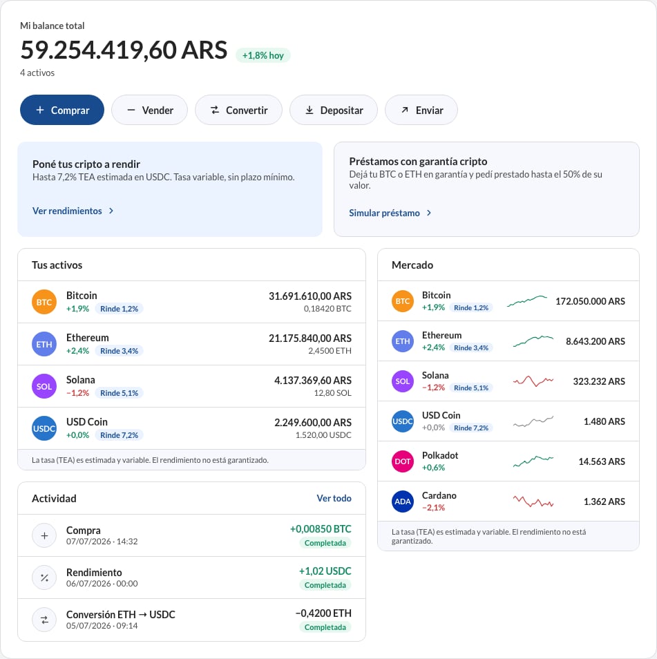
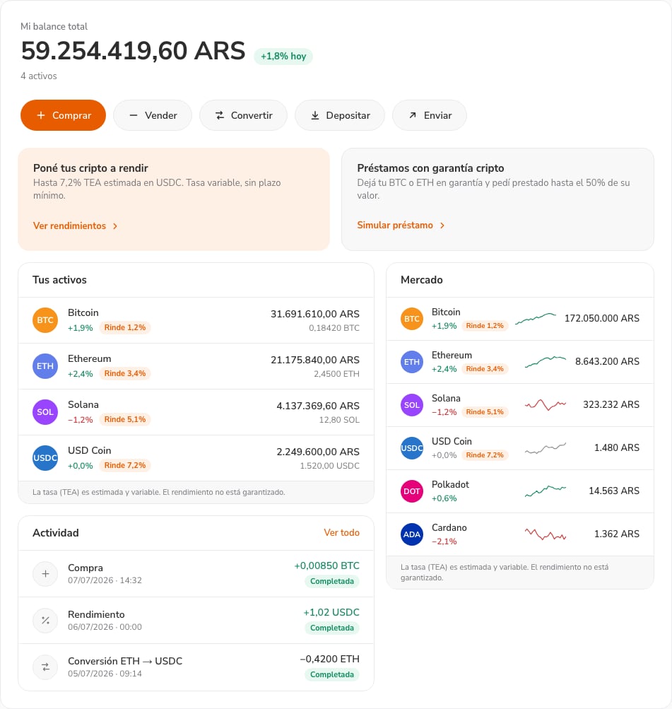
Before and after