> ## Documentation Index
> Fetch the complete documentation index at: https://docs.ripio.com/llms.txt
> Use this file to discover all available pages before exploring further.
# Theming
> Match the widget to your brand with CSS custom properties: the supported tokens and how to send Ripio your theme.
The widget's appearance is driven by CSS custom properties. You send Ripio a CSS file with the ones you want to change, it's stored against your account, and the widget applies it at runtime — no rebuild, no per-partner deploy.
### How it works
Your file only needs the variables you're overriding — everything you leave out keeps its default. A minimal theme is genuinely small:
```css theme={null}
@import url("https://fonts.googleapis.com/css2?family=Montserrat:wght@400;700&display=swap");
:root {
--ripio-font-family: "Montserrat";
--ripio-color-primary: #034cf5;
--ripio-widget-border-radius: 16px;
}
```
Theming is an account-level setting. There's no query parameter or runtime API for it — send the file to your Ripio contact. You can also override individual variables yourself at the document level; see [Embedding the widget](/crypto-as-a-service/widget/get-started/embedding#theming).
### The stable contract
These variables are the supported white-label surface. They won't be renamed, so a theme built on them keeps working as the widget's internals change. Overriding `--ripio-color-primary` alone repaints buttons, links, focus rings and selected states, because the internal tokens point at it.
| Variable | Default | Controls |
| -------------------------------------------------------------------- | -------------------- | ----------------------------------------------------- |
| `--ripio-color-primary` | `#7839ee` | Brand color: primary buttons, links, focus, selection |
| `--ripio-color-primary-light` | `#f5f3ff` | Tinted brand backgrounds |
| `--ripio-color-success` | success 600 | Success states |
| `--ripio-color-warning` | warning 600 | Warning states |
| `--ripio-color-error` | error 600 | Error states |
| `--ripio-color-info` | gray 200 | Neutral informational states |
| `--ripio-color-disabled` | gray 100 | Disabled backgrounds |
| `--ripio-color-base` | `#ffffff` | Base surface color |
| `--ripio-color-text` | gray 900 | Default text color |
| `--ripio-color-neutral`, `--ripio-color-neutral-10/20/50/80/100/120` | gray scale | Neutral ramp used across surfaces and secondary text |
| `--ripio-widget-bg-color` | `--ripio-bg-primary` | Widget container background |
| `--ripio-widget-border-radius` | `20px` | Widget container corner radius |
| `--ripio-btn-border-radius` | fully rounded | Button corner radius |
| `--ripio-font-family` | `"Lato"` | Typeface for the whole widget |
### Component and scale tokens
Beyond the contract above, the widget exposes design-system scales and per-component tokens. These are safe to override for finer control, but they belong to the design system and may be renamed as it evolves — prefer the contract above where it's enough.
| Group | Tokens |
| -------------------- | ---------------------------------------------------------------------------------------------------------------------------------------------------------------------------------------------------------- |
| Semantic text | `--ripio-text-primary`, `-secondary`, `-tertiary`, `-quaternary`, `-placeholder`, `-disabled`, `-brand-primary`, `-error-primary`, `-warning-primary`, `-success-primary` |
| Semantic background | `--ripio-bg-primary`, `-secondary`, `-tertiary`, `-brand-solid`, `-brand-solid-hover`, `-brand-primary`, `-disabled`, `-error-primary`, `-warning-primary`, `-success-primary` |
| Semantic border | `--ripio-border-primary`, `-secondary`, `-brand`, `-disabled`, `-error`, `-warning` |
| Radius scale | `--ripio-radius-none`, `-xxs`, `-xs`, `-sm`, `-md`, `-lg`, `-xl`, `-2xl`, `-3xl`, `-4xl`, `-full` |
| Shadow scale | `--ripio-shadow-sm`, `-md`, `-lg`, `-xl`, `-2xl`, `-3xl` |
| Display type scale | `--ripio-font-size-display-xs` … `-2xl`, each with a matching `--ripio-line-height-display-*` and `--ripio-letter-spacing-display-*` |
| Text type scale | `--ripio-font-size-text-xs` … `-xl`, each with a matching `--ripio-line-height-text-*` |
| Components | `--ripio-btn-*`, `--ripio-input-*`, `--ripio-dropdown-*`, `--ripio-card-*`, `--ripio-box-*`, `--ripio-chip-*`, `--ripio-divider-*`, `--ripio-toast-*`, `--ripio-overlay-*`, `--ripio-spinner-border-color` |
| Chart & delta tokens | `--ripio-chart-stroke`, `-fill-from`, `-fill-to`, `-grid`, `--ripio-sparkline-positive`, `-negative`, `--ripio-delta-positive`, `-negative`, `-neutral` |
### What not to override
The design-system primitives — `--violet-*`, `--gray-*`, `--error-*`, `--warning-*`, `--success-*` — and the transaction status-chip tokens `--st-*` are internal. They're the raw palette the semantic tokens are built from, they aren't part of the contract, and they can change without notice. Override the semantic layer instead: setting `--ripio-color-primary` propagates everywhere `--violet-600` would have.
Theming only repaints the widget — it can't reposition, resize or hide anything inside it.
### Usage
#### Customize the typography
Import the font from a static host, then set the variable that owns `font-family`.
```css theme={null}
@import url('https://fonts.googleapis.com/css2?family=Montserrat:ital,wght@0,100..900;1,100..900&display=swap');
:root {
--ripio-font-family: "Montserrat";
}
```
One variable changes the typeface everywhere: headings, body copy, inputs and buttons all inherit from it.
#### Customize buttons
Only variables starting with `--ripio-btn` modify the buttons.
**Primary button**
```css theme={null}
:root {
--ripio-btn-bg-color-primary: #787878;
--ripio-btn-font-size: 14px;
--ripio-btn-border-radius: 5px;
}
```
**Secondary button**
```css theme={null}
:root {
--ripio-btn-bg-color-secondary: #edbe73;
--ripio-btn-text-color-secondary: #ffffff;
}
```
**Tertiary button**
```css theme={null}
:root {
--ripio-btn-bg-color-tertiary: #bbcdff;
--ripio-btn-text-color-tertiary: #034cf5;
}
```
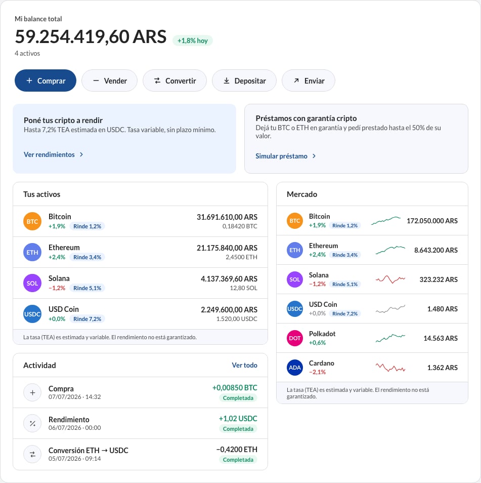
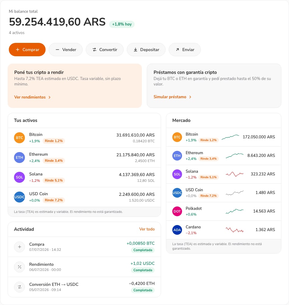
### Before and after